Teaching people to play the piano
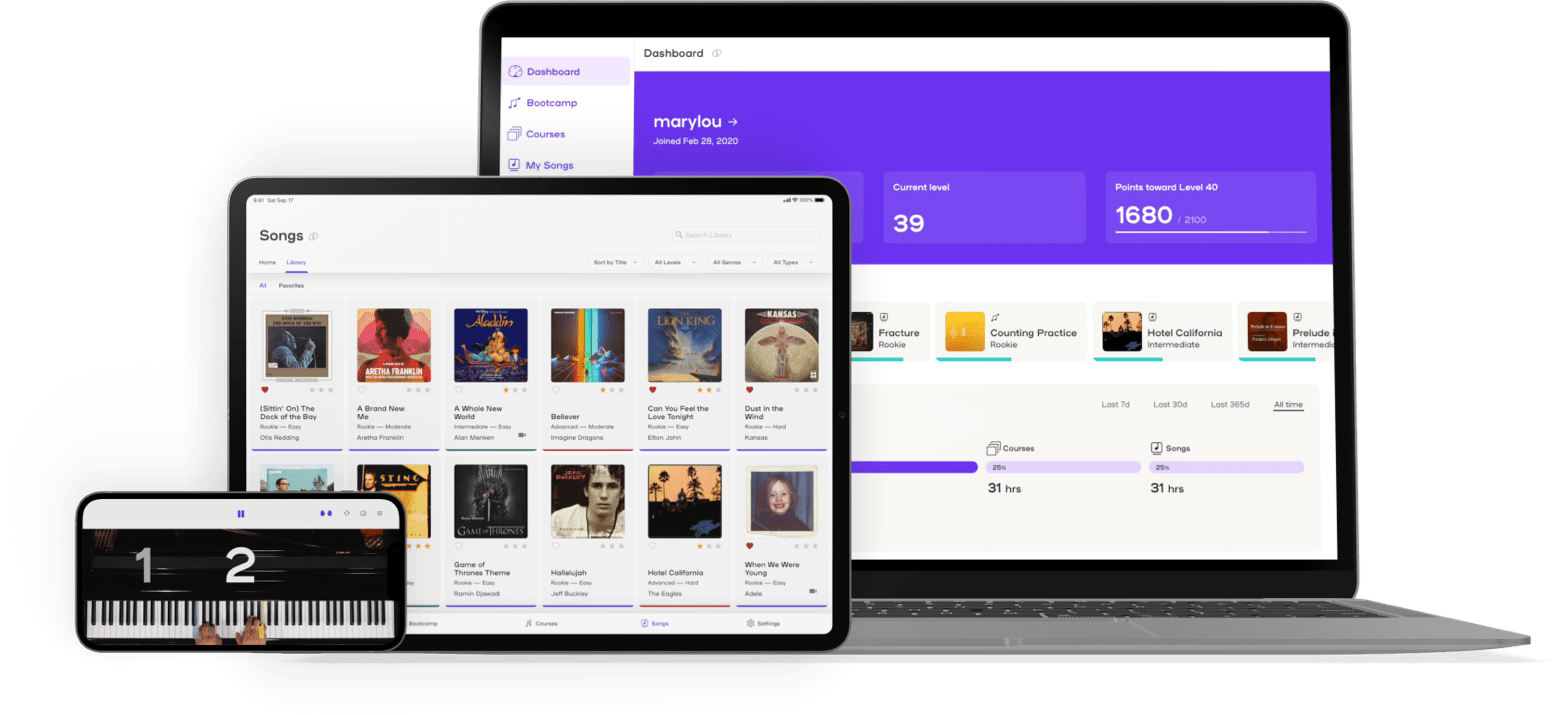
Plug and play piano!
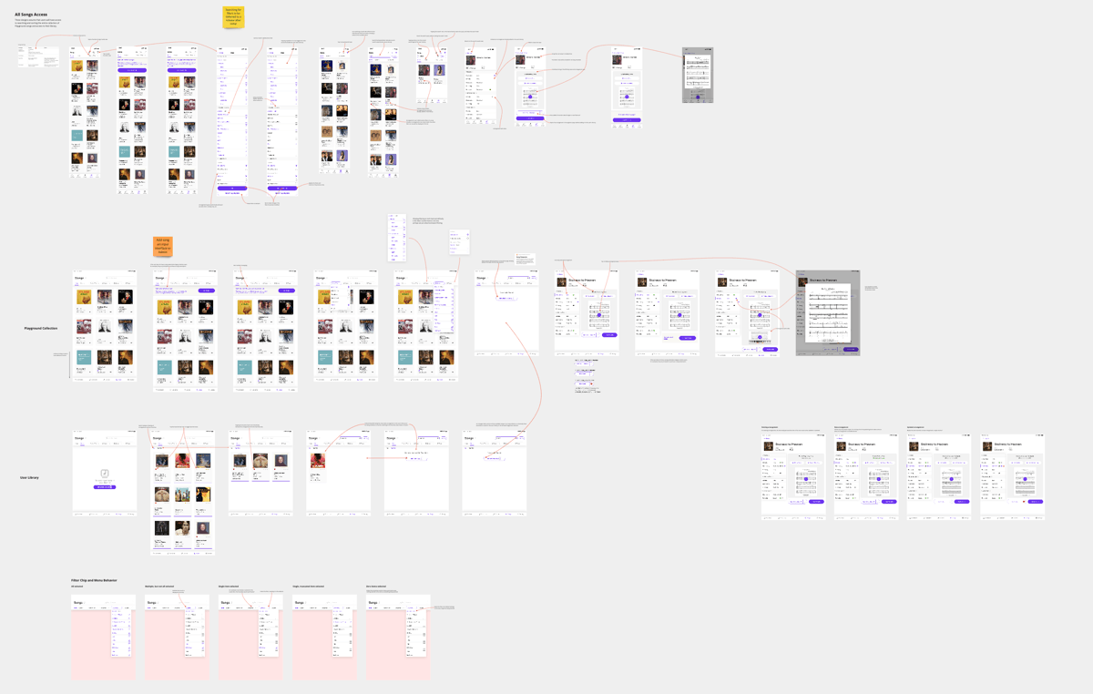
I started working with Playground Sessions as they were defining their 3.0 release, aiming to replace aging desktop and iPad apps with a modern app that would offer a greatly improved user experience and adapt to a wider array of devices.
Initially, my responsibility was to create wireframes for how the app content was to be organized and improve the interface for the lesson player, where people spend the vast majority of their time. My role expanded to include all aspects of design, front-end development, and collaboration with leadership to define the product roadmap.
Playground Sessions 3.0 has held steady at 4.8 out of 5 stars on the App Store since shortly after its release. Quite an improvement from the 2.7 rating the old iPad app garnered and the highest rated app in the category! iPad user retention also increased by 25%.
A polished player
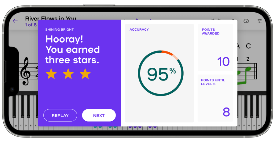
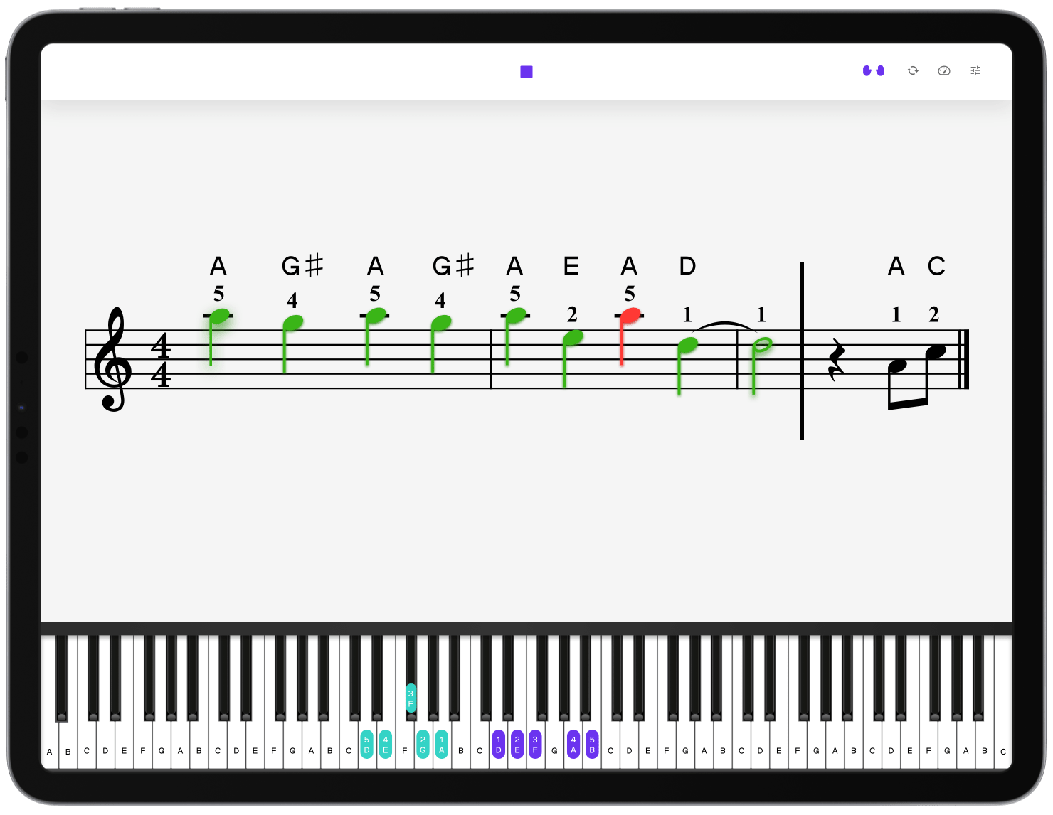
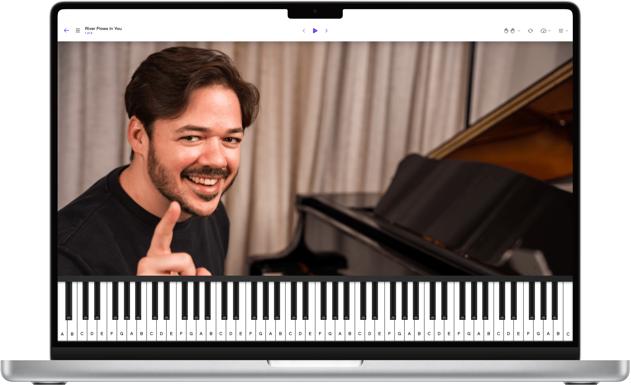
In parallel with the app information architecture, I designed the lesson player that users would use to navigate within lessons and access various tools to assist their learning. Being the area of the app used most heavily by users, it was crucial to get this right.
Conversations with team members and feedback from beta testers helped me understand which features were heavily used (based in part on support team members' experience), which could be removed, and what would be possible with the new platform. Knowing that we would be building the app for phones, tablets, and desktops, I designed for all three simultaneously to make sure we didn't paint ourselves into a corner.
Making Songs simple
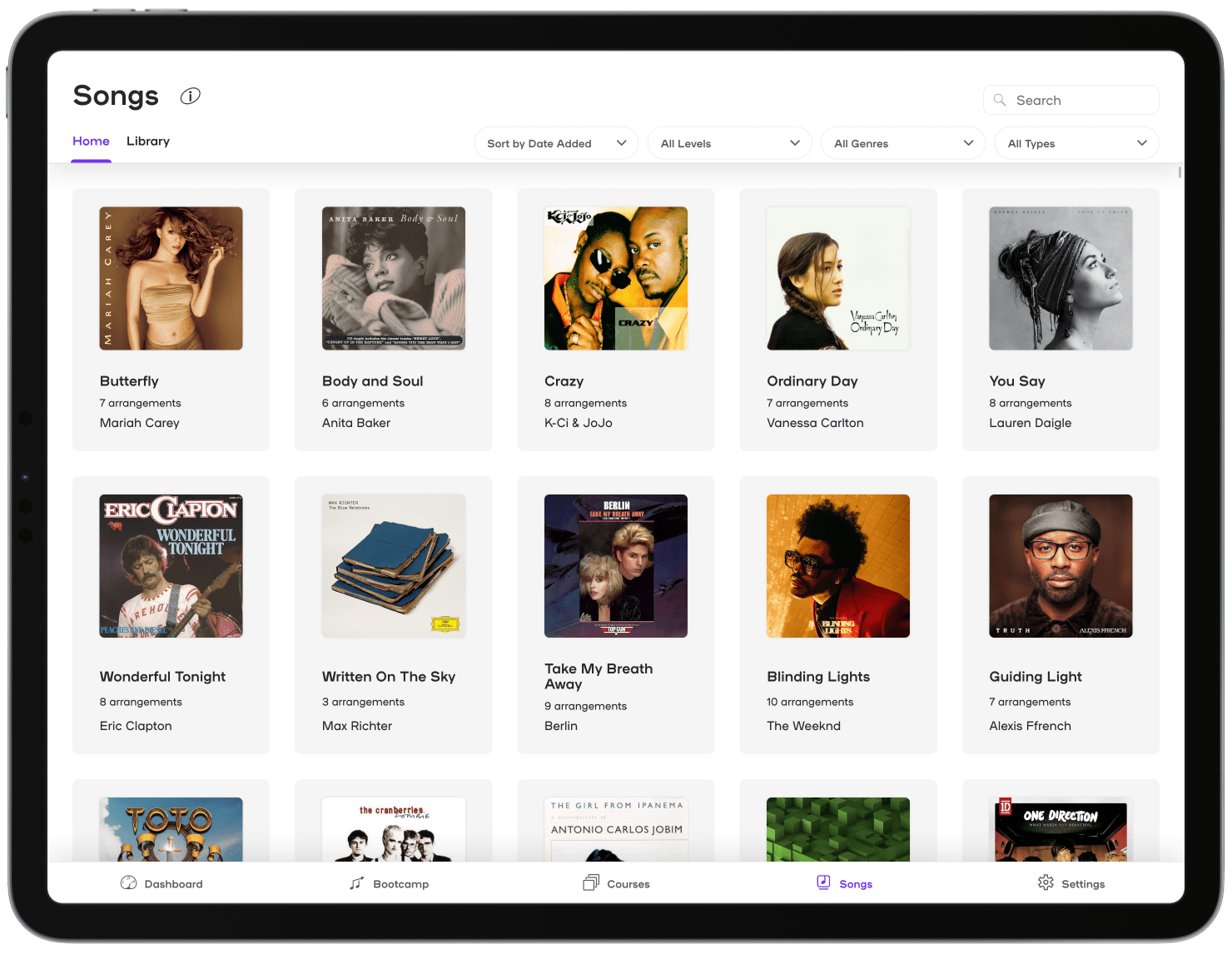
A longstanding user pain point was the many steps required to acquire and play songs. Addressing this required a significant departure, including moving from a licensing model of users purchasing or earning song credits to unlimited access to all songs being included in Playground subscriptions. I identified a number of additional shortcomings and came up with solutions based on consultation with team members and observation of user behavior in the web-based song store.
| Problem | Solution |
|---|---|
| The legacy desktop app provided in-app purchasing, but the iPad app did not. iPad users had to purchase songs through a browser or in the legacy desktop app, then navigate to them in the iPad app. | Make all songs accessible as part of subscriptions, and for a few dollars per month to lifetime members. |
| The web-based song store provided searching, but the legacy desktop and iPad apps did not. | Make search functionality available in the app on all platforms. |
| The legacy desktop app allowed viewing songs of only one genre at a time. | Provide filters that allow multiple genres to be selected. |
| The legacy desktop app only showed one of the three difficulty levels at a time. | Allow users to select any combination of difficulty levels. |
| Users with large collections of songs had difficulty finding specific arrangements among them. | Along with searching, allow users to mark specific arrangements as favorites. Favorites are then presented as a separate section of the user's song library. |
| Different arrangements of the same song were always presented as individual items, making for a cluttered interface. | Group arrangements by song to make browsing easier by reducing the content presented and redundant song artwork. |
Being an experienced front-end developer as well, I coded the vast majority of the layout components, working closely with other developers to make sure the interactions were implemented as desired. Check out the video walkthrough to see how the new Songs section works on iPad.
Performance is critical to user experience!
I took initiative to optimize song artwork images to make sure the app doesn't serve needlessly large images, which increases load time and gobbles up device memory. This effort took the image payload for the Songs section from 146 MB down to 58.6 MB (about 60%).
The ideal is to set up an automated image processing backend that ingests a high-resolution image chosen by the song arranging team, then uses that image to generate the various sizes and formats (AVIF is quite compact) needed for the app interface. Combining more modern image formats with a dynamic loading tool like React Window could reduce real and perceived load times greatly.
Rethinking progress tracking
Playground Sessions had long provided users with several ways to track their progress, including a widget to show their progress through the foundational Bootcamp courses and points they earned by playing. I noted some shortcomings in the legacy design and collaborated with the content and support teams to come up with solutions.
| Problem | Solution |
|---|---|
| The Dashboard and Progress views were only available in the legacy desktop app, not on iPad. | Make Dashboard available on all platforms. |
| Poor color contrast made information difficult to read. | Use WCAG in combination with new brand palette to increase contrast. |
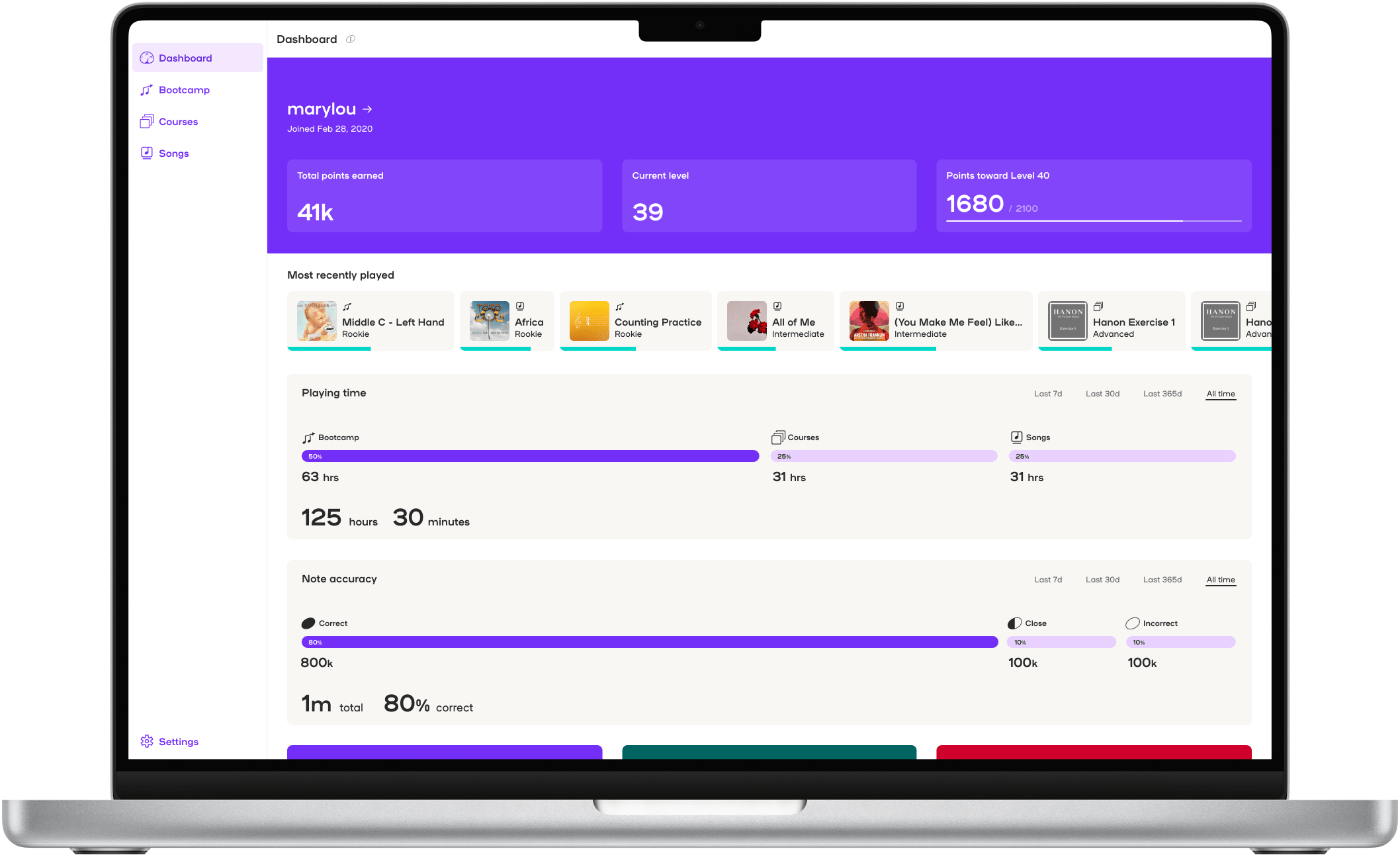
| Overall time spent in the app was not broken into meaningful categories. | Provide section-by-section breakdowns so people can get a sense of where they are spending their time. |
| Users had no way to see if the quality of their playing was improving over time. | Provide a note accuracy breakdown that shows the user's correct, close, and incorrect notes over several time periods. |
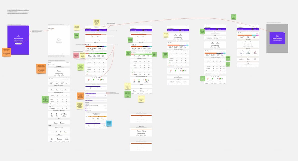
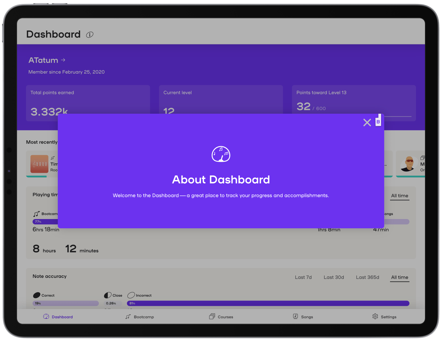
I worked with the leadership and development teams to design a new Dashboard that would retain the valuable information conveyed by the legacy app while adding new metrics and tools that would keep users engaged and allow them to see their evolution as pianists. I coded all of the new Dashboard interface components, working closely with the other developers to make sure the APIs would provide all the data needed to populate the interface.
The redesign of the Dashboard also laid the groundwork for roadmapped features to make better use of gamification to help keep people engaged in learning.
